Mail Visualizations : Message Boards
Elizabeth German
CS 465 FA 2008
Karahalios
HW 3
Motivation:
Studies have showed that weight loss is often best achieved in groups and with support from others so it
is in this spirit that WeightWatchers offers messages boards for users to communicate with another to
aid in weight loss. However, it has also been shown that this can go both ways. Your relationships can
help you lose weight, but if your friend gains weight you, yourself, are more likely to gain weight. The
point of this visualization is to help individuals find the message board that encourages the most weight
loss and the social groups that are the most helpful and to help the user stay away from those boards
and social groups that are the least helpful and potentially works against your goals.
Context:
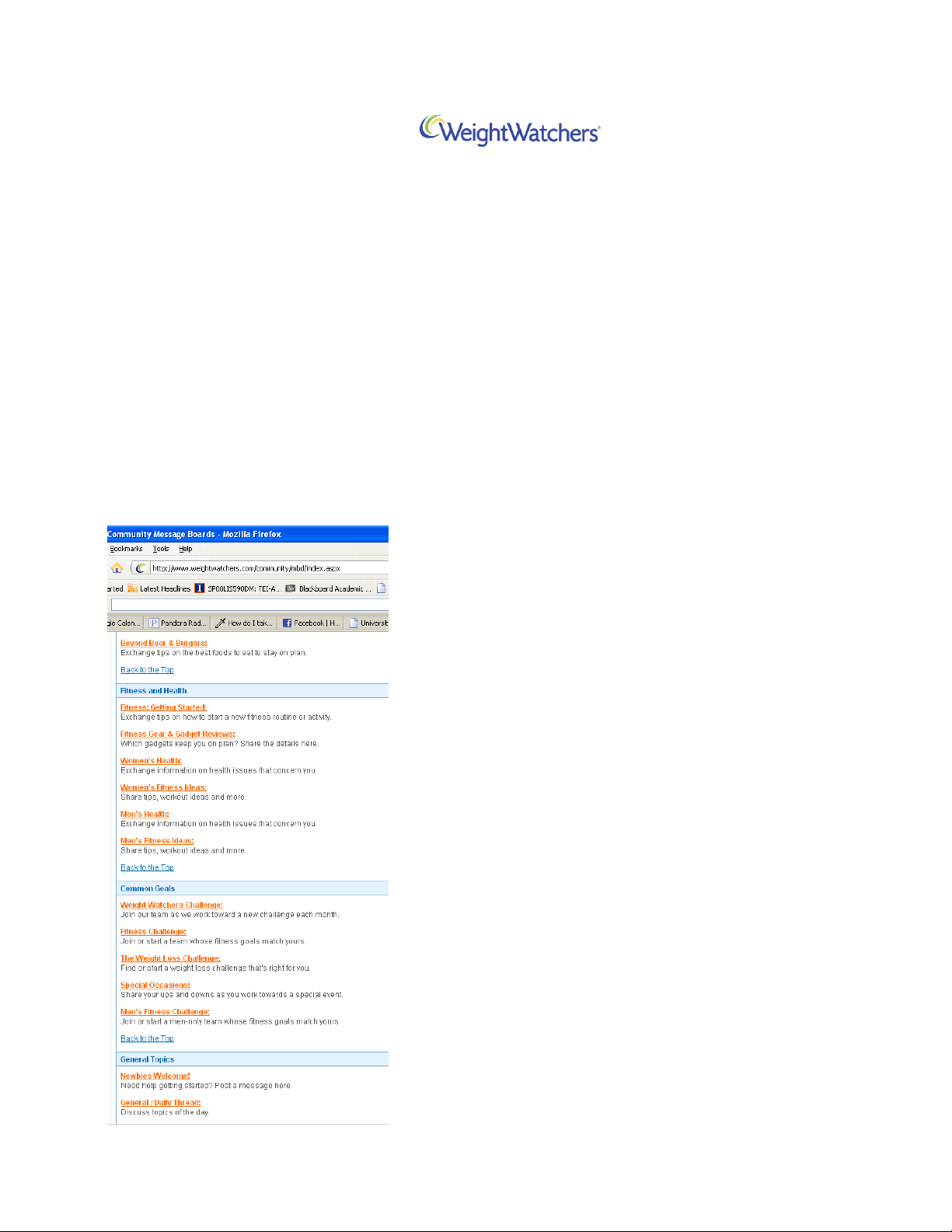
WeightWatchers host fifty six different message boards each
of which are targeted to a users need. These boards include:
On the Flex Plan, On the Core Plan, What I Ate Today, Men's
Health, Fitness Challenge, Newbies Welcome, Student Lounge,
100+ Pounds to loose, and Bravo Board. A user profile can
hold a lot of information. It can include a bio, a website but all
profiles include the user's starting weight, their current
weight, their goal weight, and all of their posts. From this
information we are going to look at which message boards
have the most crossover audience which social groups have
the users that have the most positive weight loss experience.
This experience will be measured as the percentage of weight
loss to goal weight loss as a function of time. This function of
time is to differentiate long time members from new
members and to differentiate a long time member who has
been at their goal weight for a long amount of time and a long
time member who has been far from their goal weight for a
long amount of time.