Download Graphical Representation of Sample Data: Dotplots, Stemplots, Histograms and more Study notes Biostatistics in PDF only on Docsity!
2.2 Graphical Displays of Sample Data
Dotplots, Stem-and-Leaf Diagrams (Stemplots), Histograms , Boxplots, Bar Charts, Pie Charts, Pareto Diagrams, …
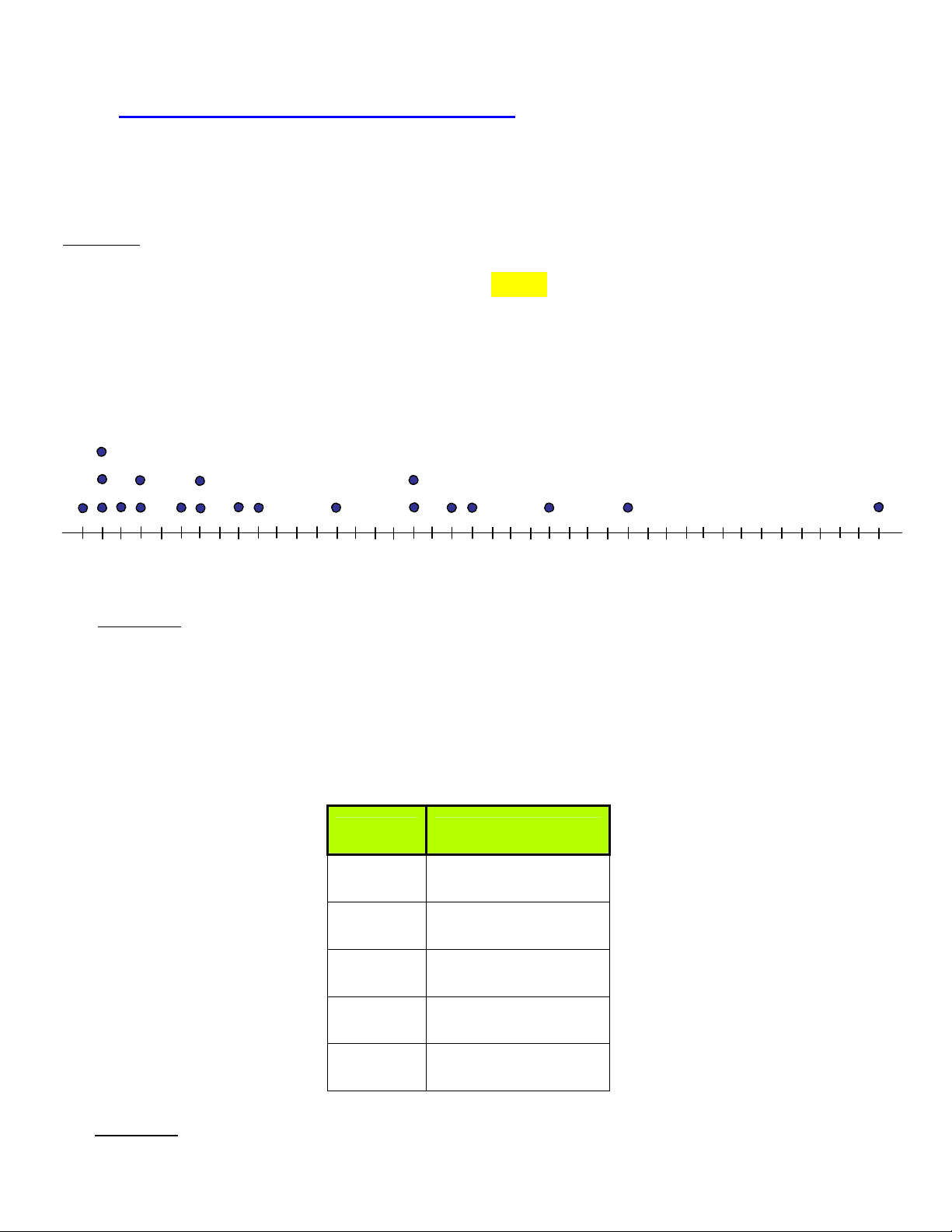
Example: Random variable X = “Age (years) of individuals at Memorial Union.”
Consider the following sorted random sample of n = 20 ages:
{18, 19, 19, 19, 20, 21, 21, 23, 24, 24, 26, 27, 31, 35, 35, 37, 38, 42, 46, 59}
¾ Dotplot
18 19 20 21 22 23 24 25 26 27 28 29 30 31 32 33 34 35 36 37 38 39 40 41 42 43 44 45 46 47 48 49 50 51 52 53 54 55 56 57 58 59
X
Comment : Uses all of the values. Simple, but crude; does not summarize the data.
¾ Stemplot
Stem Leaves
Tens Ones
1 8 9 9 9
2 0 1 1 3 4 4 6 7
3 1 5 5 7 8
4 2 6
5 9
Comment : Uses all of the values more effectively. Grouping summarizes the data better.
¾ Histograms
Class Interval Frequency (# occurrences)
[10, 20) 4
[20, 30) (^) 8
[30, 40) (^) 5
[40, 50) 2
[50, 60) 1
n = 20
Frequency Histogram
Often, it is of interest to determine the total relative frequency, up to a certain value. For example, we see here that 0.60 of the age data are under 30 years, 0.85 are under 40 years, etc. The resulting cumulative distribution , which always increases monotonically from 0 to 1, can be represented by the discontinuous “step function” or “staircase function” in the first graph below. By connecting the midpoints of the steps, we obtain a continuous polygonal graph called the ogive (pronounced “o-jive”), shown in the second graph.
Class Interval Absolute Frequency (# occurrences)
Relative Frequency (Frequency ÷ n )
Cumulative Relative Frequency
[0, 10) 0 0.00 0.
[10, 20) 4 0.20 0.20 = 0.00 + 0.
[20, 30) 8 0.40 0.60 = 0.20 + 0.
[30, 40) 5 0.25 0.85 = 0.60 + 0.
[40, 50) 2 0.10 0.95 = 0.85 + 0.
[50, 60) 1 0.05 1.00 = 0.95 + 0.
n = 20 1.
Problem! Suppose that all ages 30 and older are “lumped” into a single class interval:
{18, 19, 19, 19, 20, 21, 21, 23, 24, 24, 26, 27, 31, 35, 35, 37, 38, 42, 46, 59 }
Class Interval Absolute Frequency (# occurrences)
Relative Frequency (Frequency ÷ n )
[10, 20) 4 4 20 =^ 0.
[20, 30) 8 8 20 =^ 0.
[30, 60) 8
8 20 =^ 0.
n = 20 20 20 = 1.
Relative Frequency Histogram
0.
0.40 0.
“over-reported”
values
If this outlier (59) were larger, the histogram would be even more distorted!